Team data from Shutterstock
Filed under: Digital workplace, Intranet and digital workplace awards, Intranets, Latest Features
Dashboards are an excellent way to present a wide variety of data all in one place, from a variety of sources and systems. In the new world of the digital workplace, which emphasises a consistent user experience across different applications, dashboards are particularly compelling. Dashboards also play a key role in better, data-driven decision-making.
As well as helping managers and employees make the right decisions, dashboards can deliver value in the digital workplace in various ways, including:
- acting as the entry point into different systems
- improving processes by surfacing hard-to-access data
- bringing disparate data together to a single experience
- helping to “nudge” or encourage changes in user behaviour
- communicating key organisational-level KPIs
- supporting digital transformation
At a more granular level, specific designs and features can also add value to dashboards themselves. Here are some real examples of how organisations are using dashboards.
Supporting service delivery at Shepherd and Wedderburn

One of the ‘sector’ pages, which combines collaboration with data-driven dashboards. Screenshot courtesy of Shepherd and Wedderburn
Like any professional service business, legal firms need to keep track of a lot of information about clients and projects (matters). The big advantage that law firms have is that they have systems for everything: matter management, customer relationship management, time tracking and financial systems. Like most other types of businesses, however, these systems all run as silos, with no coherent front-end or integration.
Shepherd and Wedderburn, a UK law firm, has been at the forefront of delivering better services to staff. A winner of multiple Intranet and Digital Workplace Awards, they have consistently worked towards an intranet design that is simple and productive.
This includes bringing together content and data into the one place. In this instance, a collaboration space for the ‘Energy and Natural Resources’ sector of the business draws in figures from the client and matter systems, to provide a cohesive view of what’s happening right now.
This is just the tip of the iceberg of the dashboards created by this law firm. Obtain the full Shepherd and Wedderburn case study to delve deep into what they’ve delivered, and how they’ve done it.
Supporting digital transformation at Anthony Veder

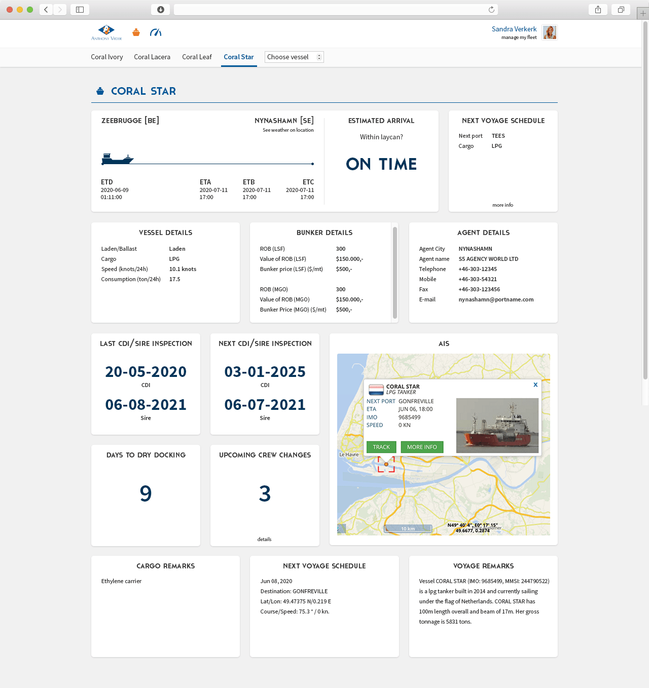
A dashboard from the Bridge which helps to manage vessels at Anthony Veder. Screenshot appears courtesy of Anthony Veder.
Sometimes dashboards go beyond improving processes and can help actually support digital transformation. Anthony Veder is a Dutch shipping company with around 1,000 employees. The company operates a global fleet of gas tankers, an activity which comes with many logistical challenges. Despite the complexity of managing a global fleet, the company had previously relied on largely manual processes which were inefficient and were literally resulting in piles of paper mounting around the office.
The company decided to go through a process of digital transformation, building a new digital workplace incorporating Skype for Business for instant messaging, Box for collaboration and a series of custom-built dashboards known as the Bridge which radically simplify the process of managing vessels. The Bridge displays data from a number of internal and cloud-based systems, so employees can view the real-time data they need.
The overall result is a saving of around 30 minutes per day per employee, as well as a completely new way of working, both which are positively impacting the bottom line.
Obtain the full Anthony Veder case study, to explore this Platinum-winning project.
Changing user behaviour at BNY Mellon

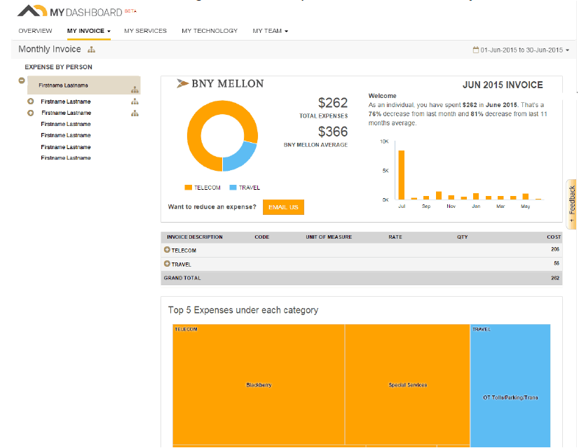
BNY Mellon’s MyDashboard showing a dashboard relating to expenses. Screenshot appears courtesy of BNY Mellon.
BNY Mellon is a US-based global financial services company with forward-thinking digital workplace program in place. As part of this the company has rolled out a data and dashboard initiative called MyDashboard which delivers personalised data to employees and managers to help enable decision-making, and to change the behaviour of users.
Information is presented on different areas such as training and development, performance indicators, expenses and technology usage statistics. Employees can view how they compare to the company average, for example benchmarking their expenses claimed, as well as seeing increases or decreases from previous months.
Viewing this data can send a powerful message to both employees and managers to take meaningful action to increase efficiency, reduce costs and improve performance. Furthermore MyDashboard is integrated with a new company intranet, with a widget on the homepage which highlights key numbers and links through to the main dashboard.
Obtain the full BNY Mellon case study, to read more about the approach to dashboards in a financial services firm.
Delivering insights about collaboration at Accenture

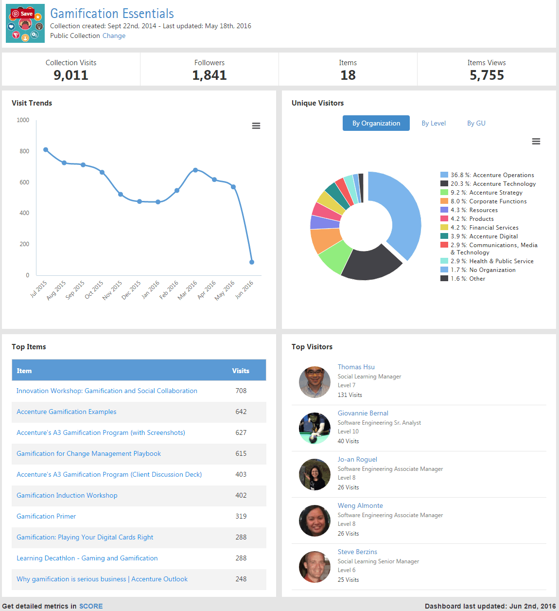
The metrics dashboard for Accenture’s “Collections” pinboard tool. Screenshot appears courtesy of Accenture.
Metrics and statistics dashboards give insights on a whole range of elements to aid decision-making. This can range from the highly strategic, with financial dashboards aimed at executives, to operational dashboards which show the user behaviour in applications.
Accenture is a global consulting firm which has developed its own custom “pinboard” solution called “Collections” for sharing different links and posts on a variety of themes. Unusually for a custom-built solution, Accenture included a metrics dashboard which reveals trends relating to visitors to an individual pinboard. This delivers insights to the manager of an individual pinboard, and provides indicators of interest in different, trending topics.
Obtain the full Accenture case study, to explore this radical approach to knowledge management.
Displaying organisational KPIs at Goldcorp

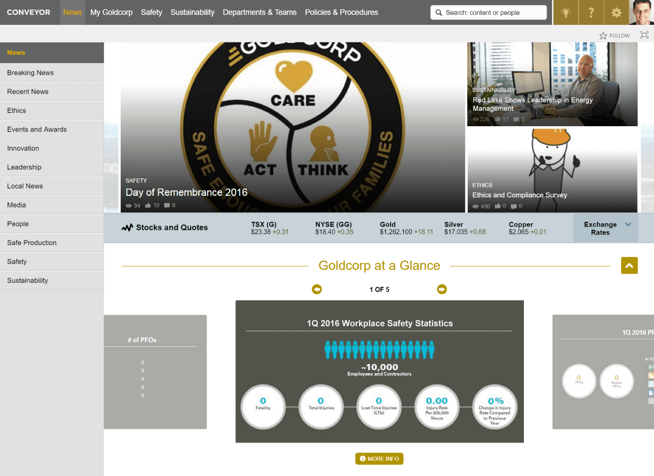
The Goldcorp intranet homepage prominently displays a dashboard of organisational KPIs. Screenshot appears courtesy of Goldcorp.
Organisational KPIs can send powerful messages to employees about company strategy and priorities, track company successes and focus employees on specific targets and priorities.
Goldcorp is a global mining company headquartered in Canada. As part of the creation of a new company-wide intranet called Conveyor, a “Goldcorp at a glance” section was created in a prominent position on the intranet homepage. A carousel displays key organisational KPIs on important themes such workplace safety, communicating these key statistics to all employees.
Read the full Goldcorp case study to understand how this resources firm delivered a rich new intranet.
We love dashboards!
Those of you who follow our blogs and publications will know we’re big fans of dashboards at Step Two. We love dashboards and we think you should too. They provide great value and also act as a great integration point for the digital workplace.
Use the examples in this post as a starting point for ideas on how you can use dashboards on your intranet or in your digital workplace to deliver process improvements, support organisational change and improve user experiences.


