
Filed under: Intranet and digital workplace awards, Intranets
Dashboards are an excellent way of providing a simple overview of information relating to operations or performance, usually incorporating considerable amounts of data originating from multiple sources.
Delivering dashboards through the intranet can bring real value to the digital channel. Providing overviews and reports on financial performance, project status or an individual’s HR data helps to cement the role of the intranet as an essential workplace tool, above and beyond a platform for communications and collaboration.
In the Intranet and Digital Workplace Awards we’ve seen some excellent and exciting dashboards. These have proved their value to users and organisations in various ways including:
- acting as a gateway to the different systems which hold that data
- presenting data that users could not previously access or which was effectively hidden in back-end systems
- displaying critical data using visualisations such as gauges to highlight a need, creating a call to action
- providing a reference or summary point for a meeting
- allowing for querying and filtering for sophisticated reporting processes
The challenge of successful dashboard design
Designing a successful dashboard takes considerable skill and needs attention to details. There are a number of challenges which include:
- presenting a large quantity of data so it clear and not overwhelming
- presenting different types of data in a consistent way
- choosing appropriate data visualisations for the right impact
- delivering a beautiful and attractive user experience
- prioritising which data to display
- dealing with sometimes sensitive data which needs to be permission-based
- integrating different systems in the back end
- addressing information management challenges
- presenting views for mobile devices
Intranet dashboards are also raising the bar by adding value to users through additional design features, some of which are genuinely innovative.
Making the dashboard interactive
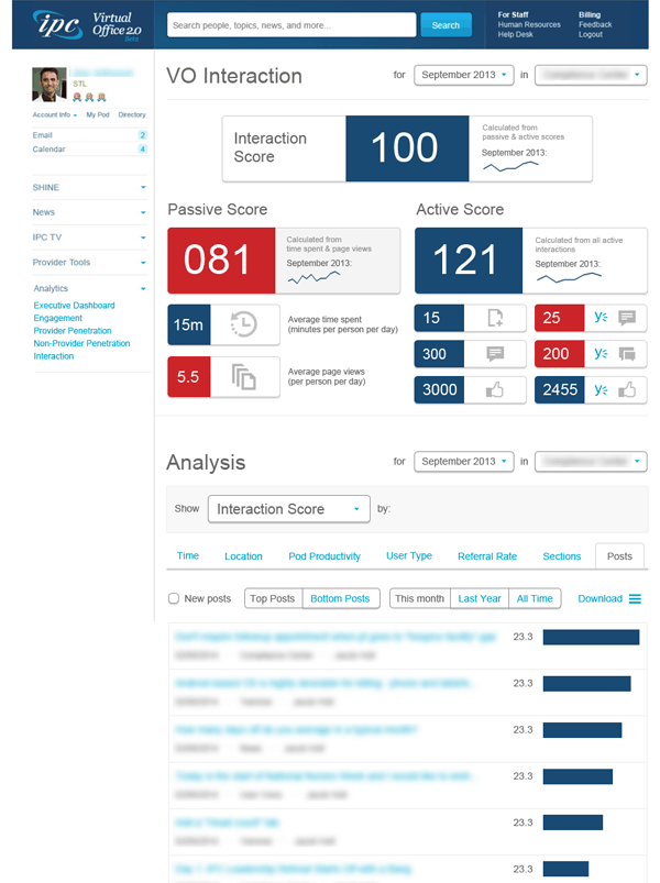
IPC The Hospitalist Company’s intranet metrics dashboard gives the user options for reporting. Screenshot appears courtesy of IPC The Hospitalist Company.
IPC The Hospitalist Company is a US-based healthcare provider. The intranet team have experimented with some new detailed approaches to intranet metrics which take in various measures. To facilitate this a metrics dashboard has been created.
To add value, the dashboard has been made interactive so reports can be filtered on various criteria including different dates and areas of the intranet. More detail can be accessed, for example a list of the top posts. This means that different site managers can take a self-service approach to intranet metrics, analysing how they are performing at a page or site level for different time periods or jumping off into other related reports.
Adding contextual information to the dashboard
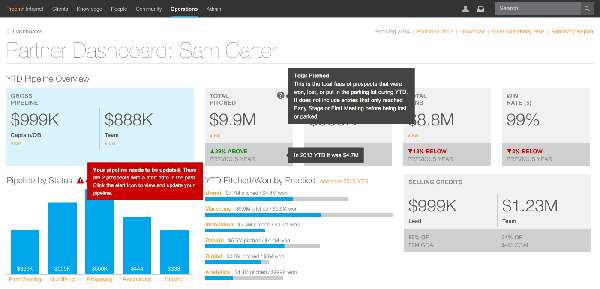
Prophet’s partner dashboard adds contextual information through hover-over text. Screenshot appears courtesy of Prophet.
Prophet is a Californian-based strategy consulting company. The intranet team has designed an impressive dashboard available on the intranet to display financial performance data for the company as well as at a function, team and individual level.
To add further value, the team has provided extensive context to the information on display. This includes previous years figures, explanations of what things mean, and alerts for where action is required. To keep the integrity of the attractive design, contextual data appears as hover-over text.
Responding to the needs of users
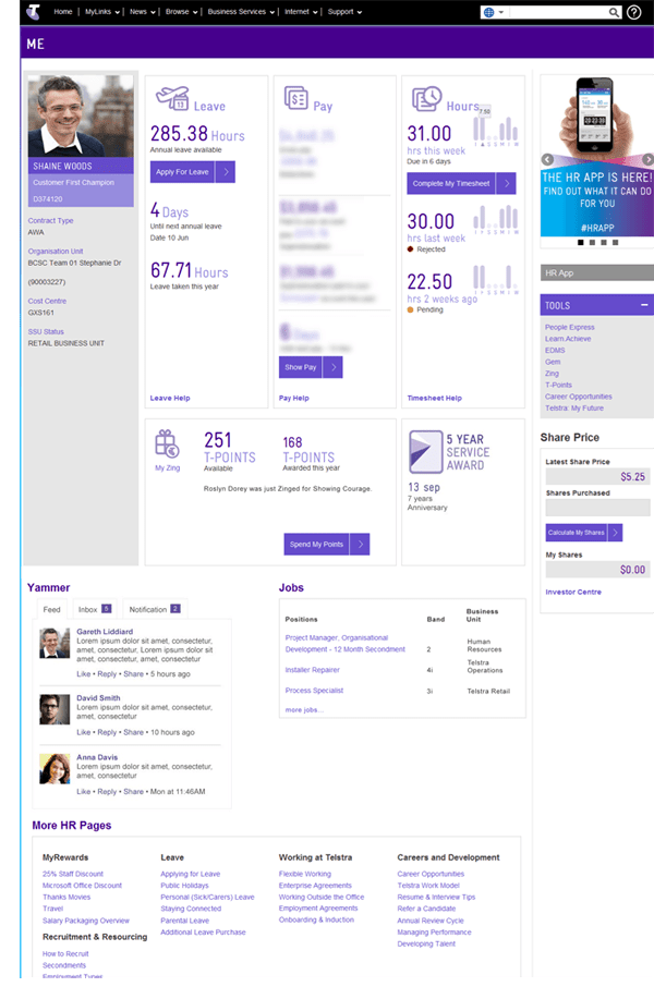
Telsta’s Me Page is a dashboard of personal HR data. Sensitive pay information is blurred out by default. Screenshot appears courtesy of Telstra.
Telstra is a major Australian telecommunications company. The company was commended by the judges for its beautifully designed HR dashboard available through the intranet. The “Me Page” gives employees a personalised dashboard of key HR information pulled from different systems. This not only involves overcoming design challenges, but also has some highly complex integration between systems in the back end.
The team at Telstra have been sensitive to the needs of their users, which was achieved through robust and detailed research.
For example, sensitive pay data appears blurred as default for individuals when the page is opened. An employee needs to click a button to read this information. This means that the HR dashboard can easily be used in an open plan office without the risk of co-workers viewing salary details, making the dashboard more likely to be used and driving adoption.
For full details and more screenshots, obtain the Telstra case study.
Making dashboards more social
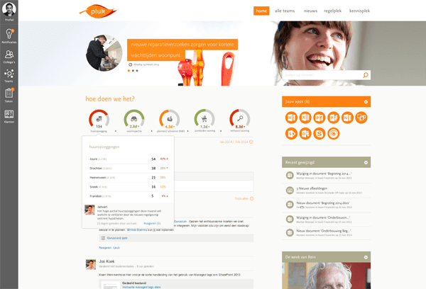
Users can add comments to Accolade’s KPI widget on the intranet homepage. Screenshot appears courtesy of Accolade.
Accolade is a Netherlands-based social housing organisation. The organisation won a Gold award for its very social intranet which also takes in more structured processes and tasks.
The homepage has a special dashboard widget which displays key organisational KPIs for all employees. Not only can employees drill down into more detail, but they can add particular comments to the widget, a relatively unusual capability. To encourage this, Accolade specifically invite employees for suggestions on how they might improve the KPIs, hoping to harness the experience and ideas of employees for organisational impact.
For a complete description and more screenshots, obtain the Accolade case study.


