Topic
Data visualisation is the graphical representation of information and data. There is a worldwide trend to deliver data in more meaningful ways to influence and achieve.
The Department of Infrastructure have been experimenting with datasets and visualisation to provide staff with instant insights into complex problems.
This session will cover:
- the different ways data can be visualised
- how simple visuals were used to create friendly competition and improve engagement between staff
- how the department has mapped road data to assist staff in identifying patterns and making informed decisions
Profile
Kat has a passion for user experience and this underpins everything she does, from SharePoint, records and data program management, to organising her shoe closet. Starting out as a graphic designer, then moving to web design, Kat now holds a management position at the Department of Infrastructure, Transport, Cities and Regional Development. In this role, she has a strategic focus on digital solutions that contribute to improving Australia’s infrastructure and growth. Kat always seeks innovative ways to improve the workplace, and has a long track record of delivering successful projects that match business needs.

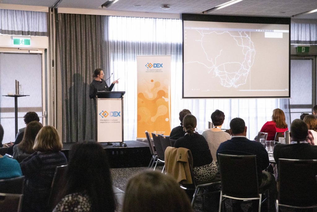
Photographs from DEX 2019
Extras