Filed under: Intranets
Above all other objectives, intranets play a vital role in providing trusted content — or at least they should! In the real world, however, it’s an ongoing challenge to create and maintain content to a standard that meets employee expectations. Regardless of whether publishing processes are fully centralised or widely decentralised, there’s a lot of content to wrangle.
A good starting point is to get everyone on the same page, in terms of what great content can and should look like. The next step is making sure you test your content with real users to ensure your content meets their needs.
In practice, great content should be:
- readable
- useful
- accessible
- findable
Drawing on winners from the global Intranet & Digital Workplace Awards over the years, we can explore each of these in turn.
Content that’s readable
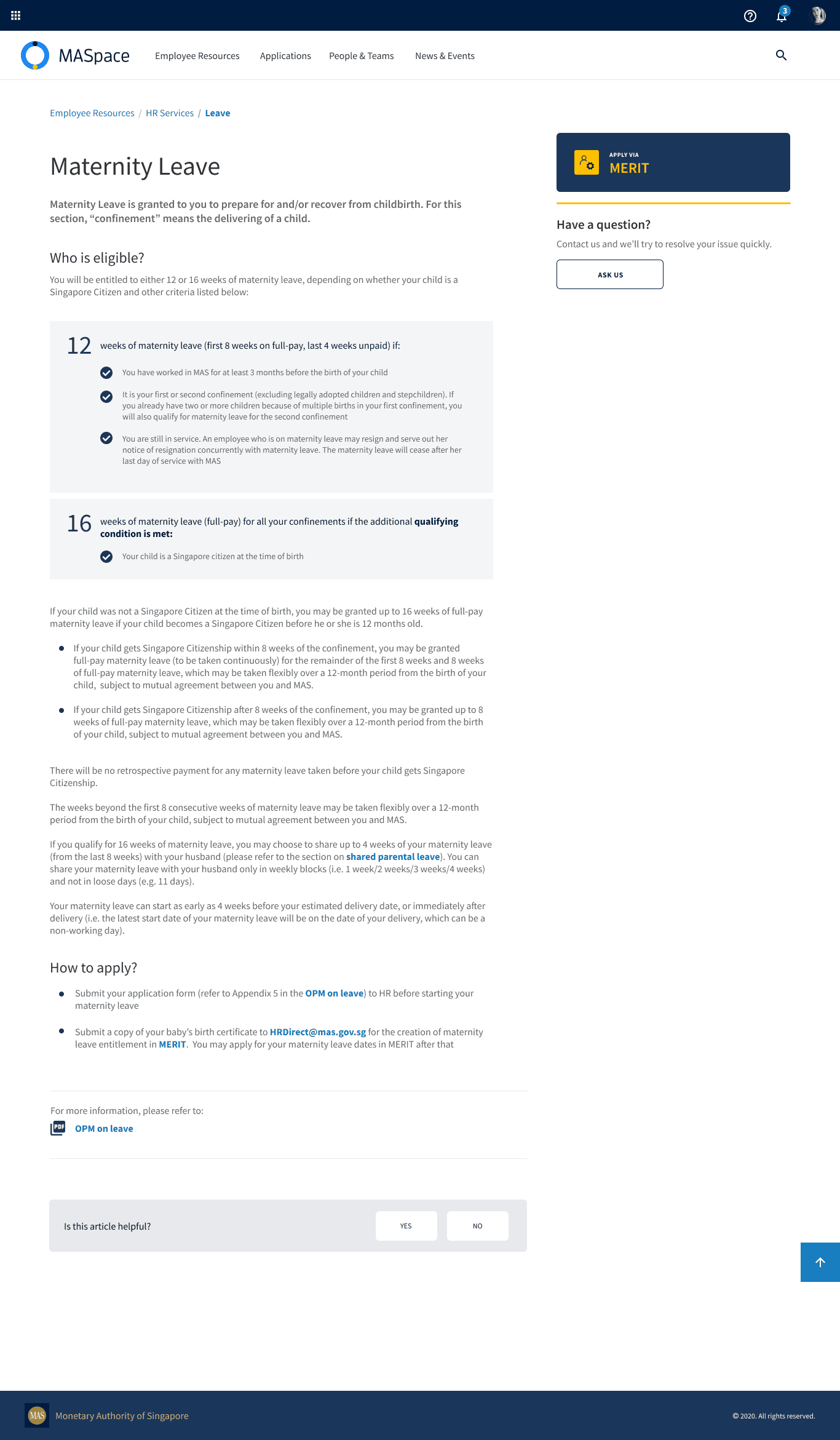
The maternity leave policy, published by Monetary Authority of Singapore.
We love showing this example from 2021 Gold Winner Monetary Authority of Singapore’s intranet. It demonstrates all the key principles at a glance:
- the most important information is at the front, following the “inverted pyramid” principle
- the page is well-structured
- the layout of the page is clean and usable
- language is simplified where possible (and explained where not, such as the legal use of “confinement”)
A lot of work goes into creating content that’s simple, and realistically it’s not possible to get every intranet page to this standard. Recognising that not all content is needs to be of equal quality, effort and support should be devoted to pages that are the most used and/or important.
(Note that the dark grey writing on the light grey callout in the example above doesn’t quite meet accessibility standards, so even great work can still need some improvement!)
Content that’s useful
It’s one thing to make sense of a page, but it’s quite another to receive the information needed to actually resolve a question or complete a task.
2024 Gold Award winner Department of Education WA didn’t stop at merging 68 intranets together over a six year period, they also demonstrated a remarkable focus on delivering useful content at an extraordinary scale.
Alongside robust governance, a key element of their approach was to establish a set of templates that each had a specific purpose in terms of its content.
For example, the narrative service content structure is for a service that requires human interaction between the user and someone in the Department.
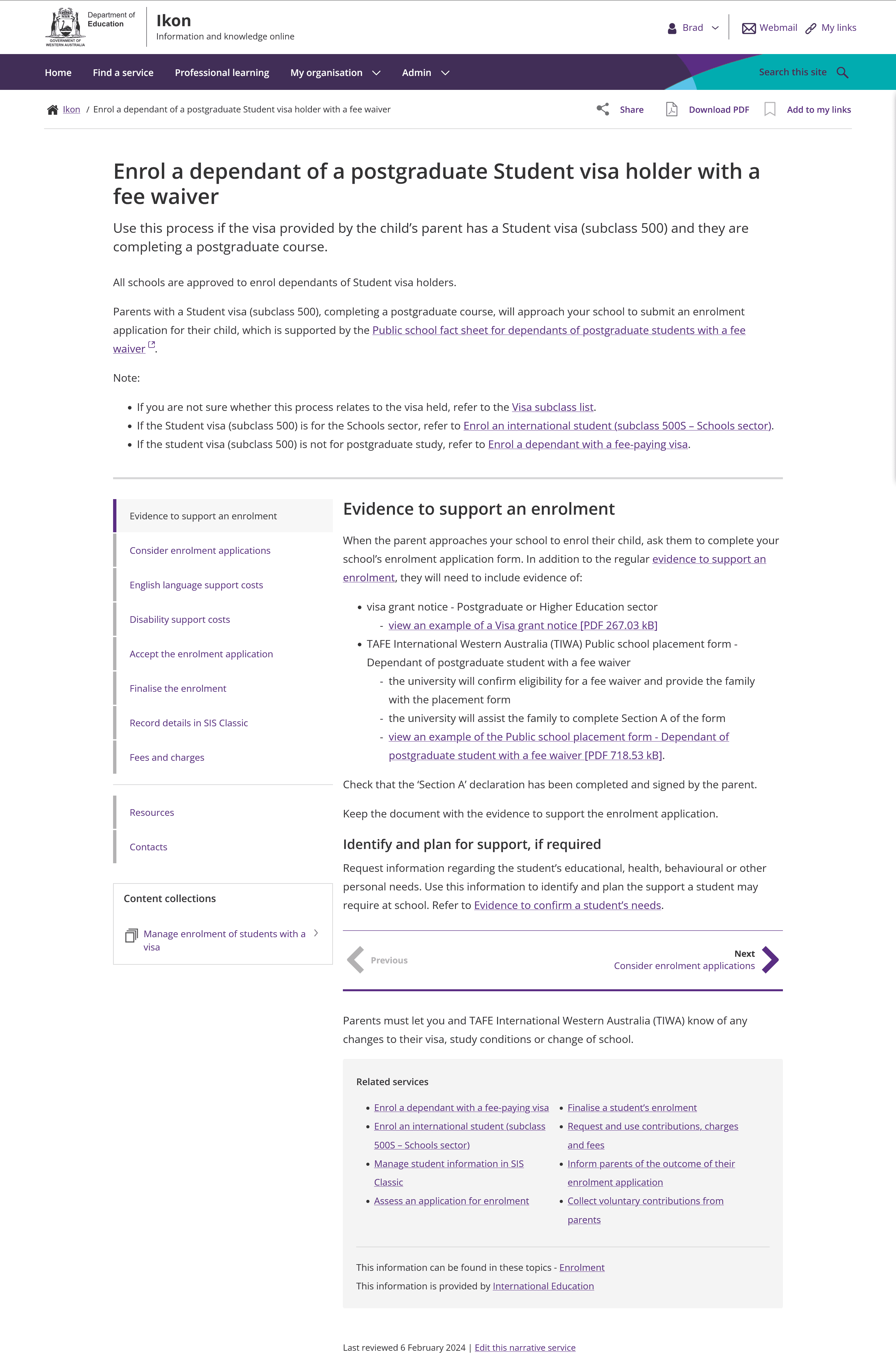
An example of a ‘narrative service’ content type, produced by the Department of Education WA.
In contrast, the supporting information content structure is used for non-service information, complex or detailed information which is supplementary to the process outlined in the service, and additional information that users may want to know, but don’t need to know to be able to complete the process.
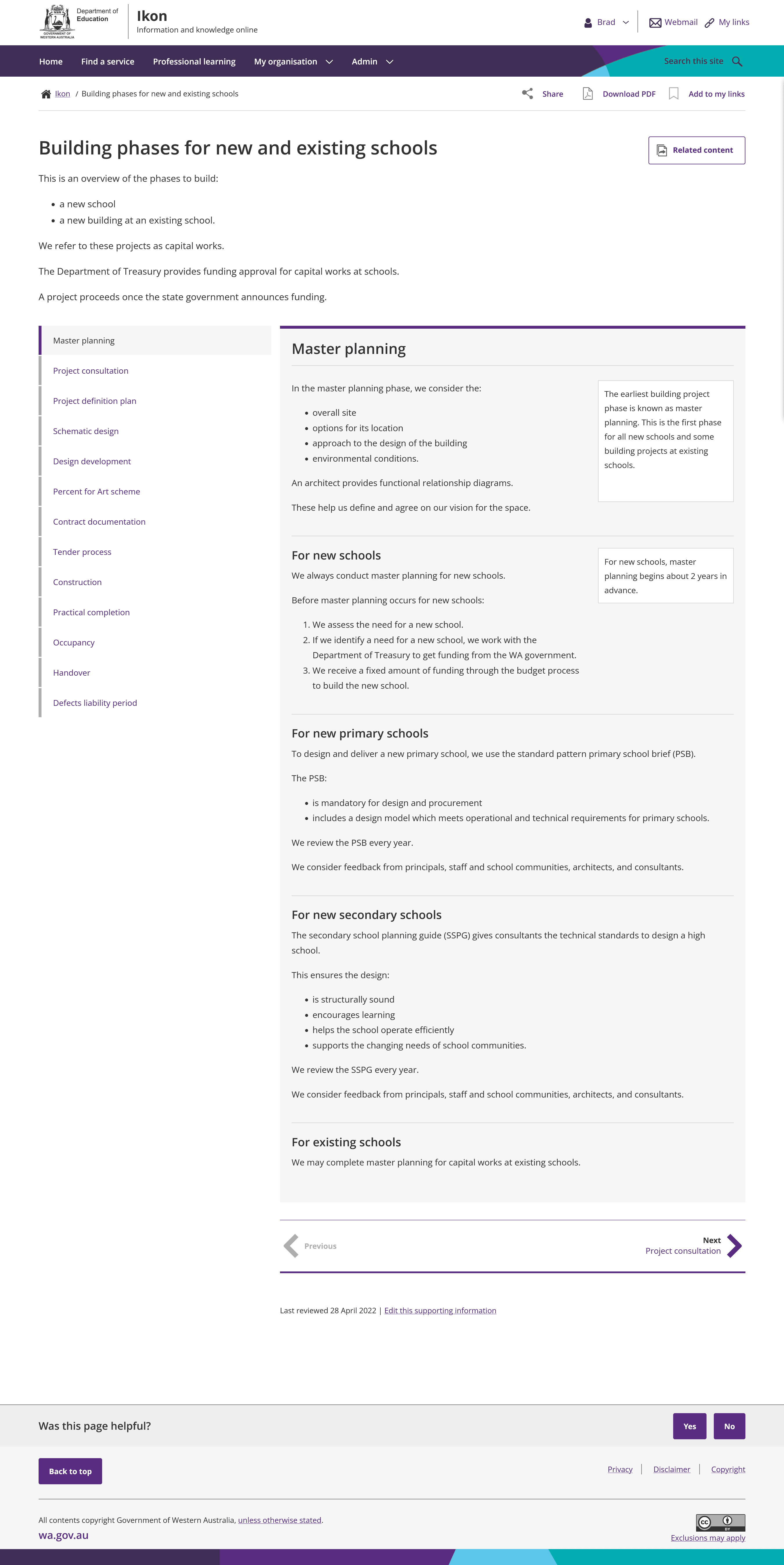
A ‘supporting information’ content template, produced by the Department of Education WA.
What’s then extraordinary is the effort they put into consolidating multiple resources across different formats into concise, readable and fundamentally useful pages. In the example shown below, two sets of multi-page guidelines, a five page FAQ and website content was consolidated into just three intranet pages, cross-linked to show related processes.
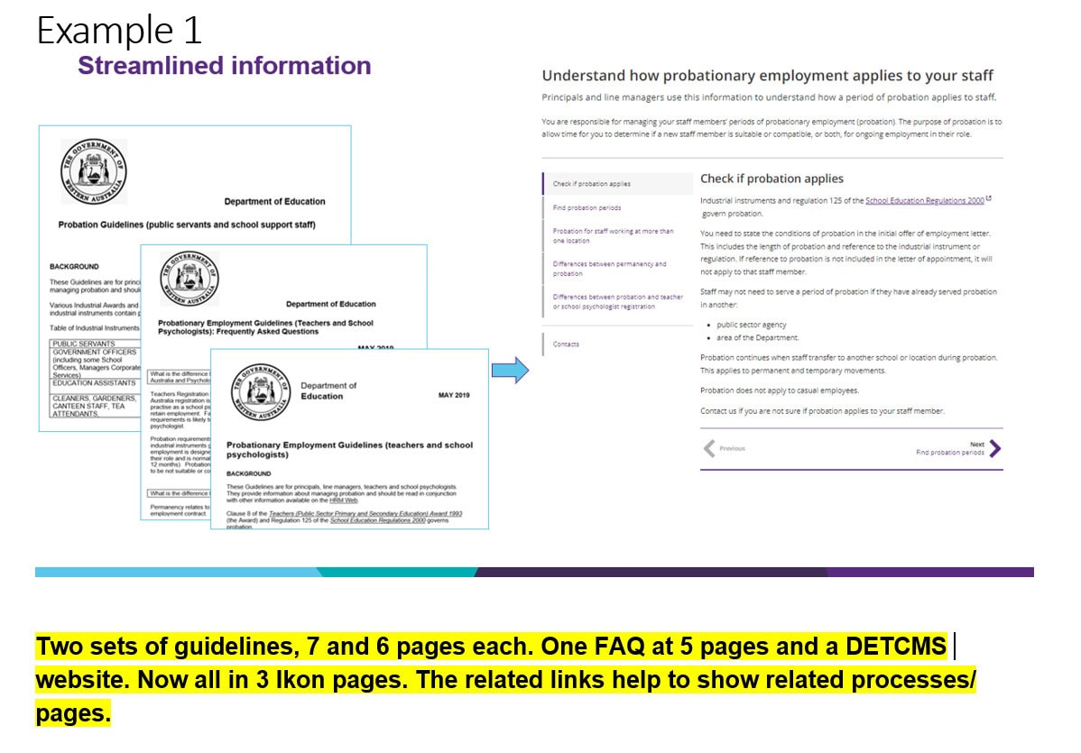
Multiple lengthy documents have been combined into a single, useful resource with handy related links. Screenshot provided courtesy of the Department of Education WA.
The work they’ve done stands as one of the most impressive examples of content improvement that we’ve seen in almost two decades of the Awards!
Content that’s accessible
There are a broad spectrum of challenges that can make it hard for employees to access the intranet, including:
- partial or complete blindness
- other visual impairments
- cognitive impairments
- neurodiversity
Beyond a clear ethical obligation to meet the needs of all employees, in many countries it’s a legal requirement to meet web accessibility standards (W3C WAI). Accessible content is also easier to read for everyone.
Historically, a major limiting factor has been the intranet technology platforms (we’re looking at you SharePoint 2013!), making it difficult and costly to meet accessibility standards. The good news is that most modern platforms (including SharePoint Online) do a reasonably good job when it comes to accessibility, and there are often third-party components available to plug any gaps.
The focus of accessibility therefore turns to the content itself.
In a recent client engagement, we worked with a government agency tasked with supporting those with disabilities. As usual, a key element of the project was interviewing employees to shape a meaningful intranet strategy. We had the opportunity to work closely with a wide range of disabled users and it made us further realise just how vital it is to bake accessibility into content from the outset to make it easier to use for everyone.
Readability of the page is vital, for time-pressed users, but particularly so for those who can’t easily scan or skim-read content.
Nuances emerged, however, which showed that usability for some employees equates to barriers for others:
- “Accordions” (expandable/collapsable sections on pages) can be great for sighted readers, but don’t help employees who are limited to reading content from top to bottom.
- Supporting details, such as lists of related pages in sidebars can overwhelm neurodiverse employees.
- Differences in page layouts require disabled employees to learn how each page is structured before they can fully utilise the content.
If content is at the heart of intranet accessibility, then support for content authors becomes critical.
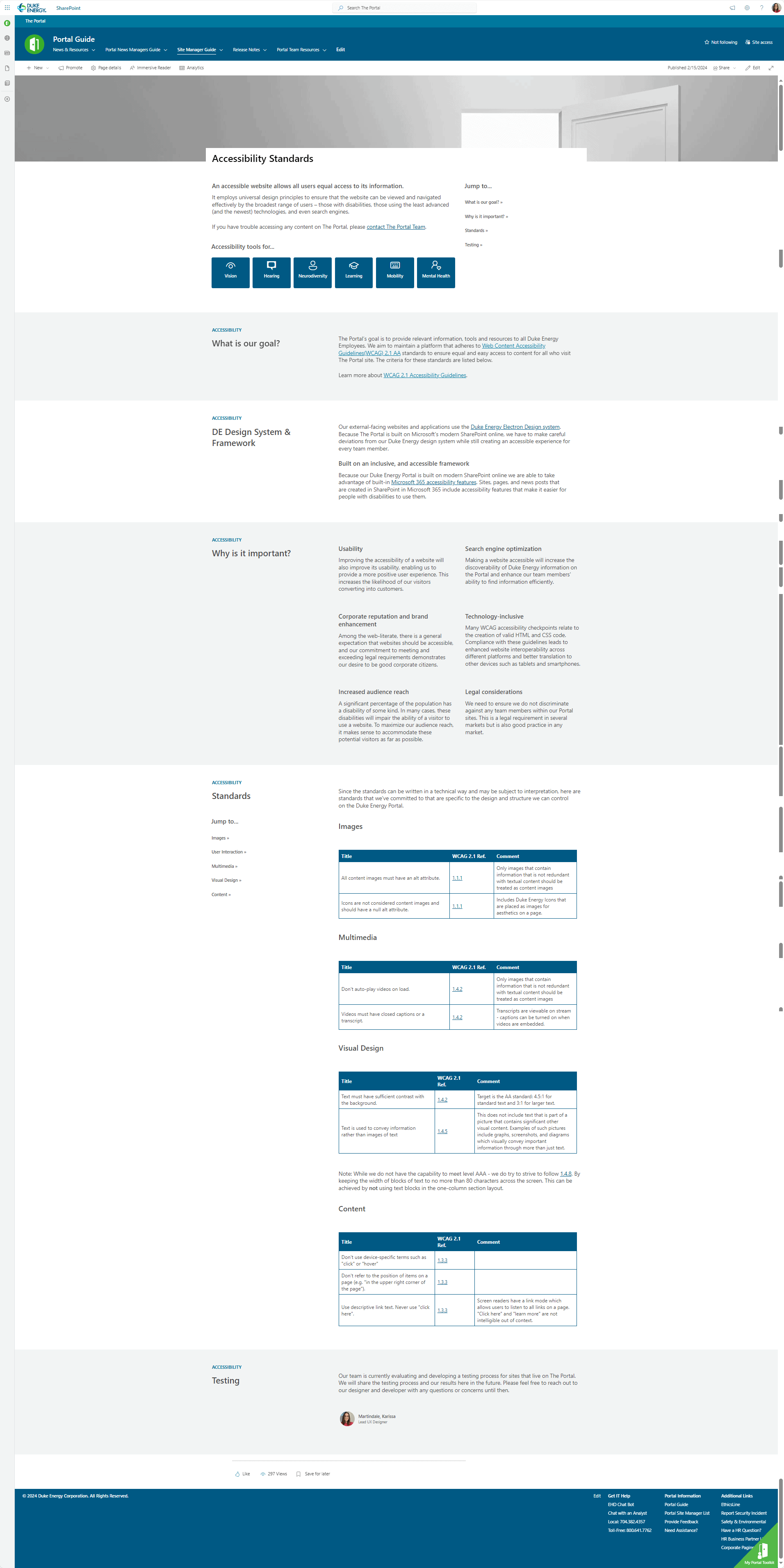
Part of the site manager resources for the intranet, addressing accessibility considerations. Screenshot courtesy of Duke Energy.
It’s wonderful to see that many of the winners of the Intranet & Digital Workplace Awards prioritise creating a set of clear resources for content authors and owners, making it easy for them to publish effective content. As shown in the example from the Duke Energy intranet above, this includes covering accessibility requirements and approaches.
Content that’s findable
None of this matters if employees can’t find quickly and easily find the content they need, when they need it. Best-practice user experience (UX) techniques are as applicable to intranets as they are to websites.
We’re again encouraged to see that winners of the Awards are using techniques such as card sorting, tree testing and prototyping to great effect.
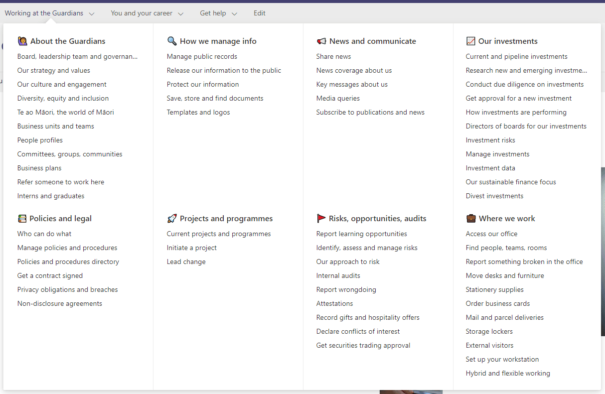
Well-structured navigation which groups common items together and uses clear terminology. Screenshot courtesy of NZ Super Fund.
The best-practice intranet project conducted by NZ Super Fund demonstrates how even a small project team can deliver a highly usable intranet. With a 39% increase in findability, they have evidence that demonstrates the improvements in usability and findability that were the product of comprehensive user engagement and user testing.
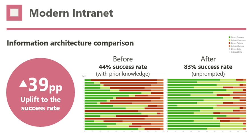
Intranet findability increased from 44% to 83%, as a result of using techniques such as tree testing. Image courtesy of NZ Super Fund.
Take steps to improve your content
There’s no one activity or approach that will guarantee that all content on your intranet is of the highest standard. In practice, a range of tactics will be required, to put shape around “what good looks like” and to support authors in their publishing activities. Strong intranet governance will also be required.


