Businessman holding tablet from Shutterstock
Filed under: Articles, Intranets, Mobile, Usability
The mobile space continues to grow at breakneck pace. Many websites are now seeing upwards of 20-30% of their web traffic coming from mobile devices. This includes both mobile phones (cellphones if you live in the US) and tablets (such as the iPad and others).
Reacting to this, many organisations are starting to deliver mobile versions of their websites. For the early movers, the question however, was what to deliver to mobiles, and how?
The majority of the web industry has now settled on an approach called ‘responsive design’.
In simple terms, a responsive design detects what type of device is being used to visit the website, and how big its screen is.
The display of the site is then adapted to match the device. This may mean dropping sidebars on smaller devices, or switching from a three-column layout to a two-column layout on tablets, and a one-column layout on mobiles.
There is now a whole industry around responsive web design, and many variations on approaches.
Lagging somewhat behind, mobile is now becoming a big issue within the enterprise. Increasingly, staff in the field, as well as those sitting at desks, are expecting to be able to use both phones and tablets to do their work.
For intranet teams, is responsive design the right approach for intranets, as for websites? This article outlines the options, and discusses possible approaches.
How should the intranet be presented on mobile devices?
What is responsive design?
The basic principle of responsive web design is simple: display information (content and images) in a way that matches the size and capabilities of the device being used.
This recognises that a design that looks great on a desktop or laptop with a big screen won’t usually work on a phone with a small screen. Even modern tablets with high resolution screens are often still too small for standard web designs.
In practice, this involves making changes such as:
- reducing the number of columns in the layout
- eliminating supporting elements, such as sidebars
- reducing or eliminating graphical elements
- shrinking the size of items, such as pictures
- reworking navigation options
- generally simplifying page designs
- adding mobile-specific features
In technical terms, this is often done by using a ‘media query’ that presents a different stylesheet (CSS) for devices other than standard screens.
It’s therefore possible to present different designs based on screen size, with one for small devices, and another for big devices.
Javascript can also be used to make more advanced changes, although this can cause compatibility problems.
For more on responsive design, use the Wikipedia page as a jumping off point:
en.wikipedia.org/wiki/Responsive_Web_Design
Responsive intranets
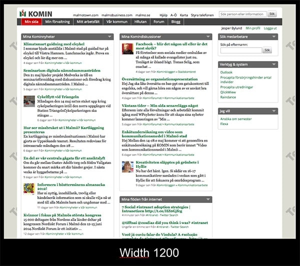
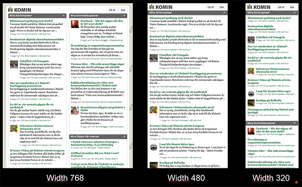
The designs from Malmö Stad (the city of Malmö in Sweden) show how responsive design can be applied to intranets.
The default view, for desktop-based users, presents a three-column view. The first two columns contain content and links, with a sidebar containing supporting details.
As the size of the device shrinks to a tablet, the display shifts to two columns. Mobile phones are presented with a one-column view.
The same information is presented on all devices. On the smaller devices, the layout is ‘stacked vertically’, rather than showing in columns on a single screen.
This ensures that information is accessible, at least in a basic form, regardless of how the site is being viewed.
For more on what was launched and why, read Jesper Bylund’s blog post:
jesperby.com/2012/05/28/an-intranet-for-the-mobile-devices/
A responsive intranet can be used on all devices


Responsive web design in action, showing how an intranet can adapt to match the size of the device that’s being used. Screenshots courtesy of Malmö Stad.
Advantages of responsive intranets
Applying responsive web design to intranets provides a number of benefits:
- One intranet can serve the needs of all staff, regardless of what device they are using.
- The intranet is not locked into a single device (as would happen if it was delivered as an iPhone app, for example).
- Even older phones can make use of the intranet, if the design is done carefully.
- Delivering a single, adaptive site eliminates any duplication of content.
- The site retains flexibility over time, as the size and nature of devices inevitably changes.
- The development of the intranet can draw upon the extensive resources already produced for creative responsive web sites (eg tutorials, code samples, etc).
- The extra cost of producing a responsive design as part of an overall site redesign or rebranding is minimal.
Weaknesses of responsive intranets
The application of responsive design to intranets is not without its problems, however. These include:
- The full content of the intranet is presented to mobile devices, which can be impractical to use on small screens.
- Even though the whole intranet can be delivered to a mobile device, is this what staff need when they’re away from their desks?
- The interface isn’t really designed for touch screens, which makes it harder to click on links, for example.
- Sites can be slow on mobile devices, as the full page is downloaded before being tailored on the device.
- Responsive web design only covers the ‘core’ intranet, as published by the content management system. Frequently used tools, such as HR self-service, are not covered by the new designs, and probably won’t work well on mobile devices.
- Without significant reworking, more complex functionality, such as filling in forms and using web applications, will be difficult on mobile devices.
The reality is that responsive web design is the ‘easy option’ for intranets. It provides basic accessibility for all devices, but leaves mobile users with a huge site to navigate.
With only modest benefits provided to mobile users, staff are likely to become unsatisfied with the mobile solution in comparison to the elegance of consumer apps and tools.
Consider mobile when redesigning the intranet
Make your new intranet responsive by default
In this modern age, any intranet redesign project currently planned or underway should deliver a responsive intranet.
The cost of doing so is small in the scheme of things, although some intranet platforms may make it harder than others.
With the growth of ‘bring your own device’ (BYOD) and enterprise mobility in general, it won’t be long before a mobile-friendly intranet will be required. So it’s better to make provision for it today during the redesign project, rather than be forced to do another mobile-specific redesign later.
Teams must also recognise the limits of responsive web design when designing and delivering an intranet.
As discussed in the article What six things do staff want on their mobile devices?, the reality is that staff don’t want all five thousand intranet pages on their mobiles. It’s hard enough to find what they need when sitting in front of a big screen at a desk, let alone when using a touch interface on a small screen when on the go.
A responsive intranet should therefore be designed to meet two basic use-cases:
- As a default design that will provide a better (if not great) interface on mobile devices.
- As a tablet interface, where the full intranet may be required on a device with a larger screen, when a PC or laptop isn’t being used.

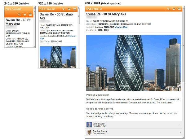
Responsive design can also be applied to key information resources, such as this projects database. Screenshots courtesy of Arup.
Create ‘responsive services’
While applying responsive design to an entire intranet may provide limited value, it can be useful to focus on making specific information sources or services mobile-friendly.
For example, Arup has used responsive web design when delivering their ‘projects database’, as shown on the previous page.
This is a core information resource for the entire organisation, allowing staff to look up what’s been done before. It’s also a valuable tool for sales staff when talking to prospective customers.
While it’s a very detailed resource, presenting the full information to a mobile device still makes sense. So responsive design is a good fit, allowing a single resource to be used throughout the organisation.

While responsive design is useful as a ‘default’ mobile view, a more effective solution can be to deliver a true mobile site, focusing on a handful of key tasks. Screenshot courtesy of UK Parliament.
Design a true mobile interface
Following the principle of delivering a handful of key services to staff when they’re away from a desk, intranet teams should plan to deliver a true mobile interface.
The example from UK Parliament on the previous page shows what this can look like. Instead of a whole intranet squeezed onto a mobile device, the intranet team delivered a handful of common details and tools that are needed by members of parliament.
The result is simple and elegant, while still supporting future expansion. Elements such as the projects database in the Arup example can then be ‘slotted into’ this design as required.
In this way, the mobile interface becomes a mix of tailored interfaces and responsive versions of intranet content. This provides a best-of-both-worlds solution that can be grown and improved over time.
Summary
Mobiles have become a part of our lives, and they will soon be having a big impact within our organisations.
It’s an exciting time for intranets, and mobile devices provide a unique opportunity to finally deliver information to staff wherever they are, and whatever device they’re using.
Intranet teams must therefore start to deliver mobile-friendly corporate solutions as quickly as possible.
Responsive web design is a natural element to include in contemporary intranet redesigns. This gives universal access to intranet content, regardless of the devices being used.
Responsive intranets should only be seen as a good-enough solution in the short term, with plans made to deliver solutions that are specifically designed for mobile devices and touch screens.


