Jewelry store from Shutterstock
Filed under: Articles, Intranets, Usability
Intranets must be productive and easy to use if they are to be successful. As outlined in the earlier article Why staff visit the intranet, there are two things that bring staff to the intranet:
- to find a specific piece of information
- to complete a task
In both cases, staff come to the intranet at the point of need, with a clear goal in mind. If the intranet is well-designed, and they can find what they are looking for, they will then close the intranet and get back on with their job.
Intranet teams work hard to deliver this vision, carefully crafting the homepage and top-level navigation menus. Major sections, such as HR, IT and Finance are also designed to improve task completion.
This still leaves a lot of content. In any larger organisation, there will be many business unit sites or sections on the intranet, and these can quickly become filled with ‘blah blah’ or ‘about us’ content.
Irrelevant content and poor page designs can have a huge impact on the intranet as a whole, reducing usability, findability and staff satisfaction.
Even in the absence of a major intranet redesign or content cleanup, redeveloping business unit landing pages (their ‘shop windows’) can greatly improve the site.
This article will outline the problems of poor design, and will share examples of how to deliver business unit sites that work. Best of all, these improvements can be made incrementally, within the limits of the central team’s time and resources.
Three types of content
There are three broad categories of content:
- core staff and organisational content
- business-unit specific content (‘shop window’ content)
- ‘back-office’ content
Efforts naturally focus on the core corporate content. Recognising that staff will always struggle to find information if they have to know who owns it first, the core intranet should be structured along task and subject lines.
This means bringing together information from a range of business units into a single navigation scheme that makes sense to staff.
In an ideal world, all intranet content would be structured this way, but this is unrealistic in all but the simplest of circumstances.
In larger organisations, there may be hundreds of business units scattered across the globe, many providing services to the rest of the business.
Each of these business units will typically have an intranet site, section or page, sharing information on the services they offer.
The design of these ‘shop window’ spaces is critical. If they are well-designed, staff can quickly and easily find what they need. If they are filled with ‘blah blah’ content, they clutter the intranet with irrelevant content that gets in the way of completing tasks.
While intranet teams don’t own any of these spaces, they can play an important role in setting standards and developing templates. They can also work closely with the business units to help them deliver pages that work. As a result, the usability of the whole intranet can be improved.

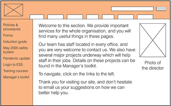
An all-too-common design for business unit ‘shop windows’, filled with blah blah content instead of useful links and tools.
Blah blah content
Too many business unit sites or sections look like the example above. All of the navigation is squeezed into the left-hand menu, leaving the body of the page with no clear purpose.
To fill the space, a ‘welcome to this section’ blurb is written, outlining the activities of the business unit and providing a ‘hello’ message.
Business units can also see these pages as a place to promote themselves, the function they play within the organisation, and the services they can offer.
This might include the unit’s latest news and updates, or a calendar of upcoming events.
In some cases, these pages are left almost entirely empty, with just a ‘clink on the links on the left to find what you need’ message, and perhaps a clip-art image.
While ‘about us’ information is needed, particularly for staff who have just joined the organisation, this is not the place for it. Instead, it should all be collected together into a single ‘about the organisation’ section of the intranet.
On these pages, this ‘blah blah’ information actively gets in the way of staff finding what they need, or completing their tasks.
Worse yet, it may lead the business unit to think that if they publish their news on these pages, then everyone automatically hears about it.
Once a pattern of ‘blah blah’ content is established on the intranet, it can be quite hard to eliminate.
When creating a new site or section, business units will look at what everyone else has done. Seeing that the landing page is used for ‘welcome’ information, they take the same approach.
Content owners are not creating this content ‘for the sake of it’ or for ‘ego’ reasons. Instead, they see that this is the way it should be done, and simply follow the pattern already established across the intranet as a whole.
The result is a confusing, wordy and hard-to-navigate intranet. Where design standards haven’t been enforced, it can even make it feel like a collection of different intranets, rather than the one site.
The challenge in fixing these pages is that the intranet team doesn’t own this content. It is, and should be, owned by each individual business unit.
This is not to say, however, that the design cannot be improved. Even some simple changes can have a big impact across the intranet as a whole.
Creating good ‘shop windows’
When working with business units to improve their sections, a ‘shop window’ metaphor can be useful.
This focuses on the information and services the business unit provides to the rest of the organisation, whether to all staff or just a few key groups.
The ‘shop window’ landing page of their section presents desired and needed items in a clear and attractive way, visible from the street outside. Careful thought goes into the design of the shop window so it is easy for current and potential customers.
The shop window is also placed on a busy high street, so that there is plenty of foot traffic going by.
This metaphor helps business units to think about what might go into their shop window, how to design the page layouts and content, and what to do to make sure staff can easily find their section.
The screenshot above shows what this can look like. Eliminating the ‘blah blah’ content, the body of the page is used for navigation, allowing staff to find what they need with a minimum of clicks. Information is also written in plain language, based on the results of user testing.
More of the good
Fundamentally, the landing pages of business units are navigation pages. This means that they should be designed to support finding information, ahead of other purposes.
‘Shop windows’ should therefore focus on:
- Providing links to common and useful information needed by visitors to the section.
- Surfacing key tools needed by staff, whether as links or directly as applications.
- Grouping information into categories, escaping the usability problems of long lists of items.
- Using clear names and links, matching how staff think, not the internal structure and practices of the business unit.
Less of the bad
Effort can then be made to reduce or eliminate the irrelevant information that clutters up many shop windows.
Consider:
- Eliminating local news, instead encouraging business units to publish their news on the homepage, where it’s warranted.
- Eliminating, or at least restricting, ‘about us’ information, moving it where possible to a central ‘about the organisation’ section.
- Removing ‘welcome to this section’ content entirely.
- Using graphics only where they are relevant and useful, avoiding merely decorative images.
- Replacing jargon and acronyms with plain language content and links, matching how staff think.
- Avoiding long lists of links or files, recognising that A-Z lists are only easy when staff know what letter an item starts with.
Even when sections can’t be entirely redesigned, small changes that are more task-focused can have a big impact.
Importance of templates
Content owners and publishers have very little time to create and maintain their sections of the intranet. With limited knowledge about usability (or the web in general), they do what they can to deliver something that will work for staff.
The supporting role of the central intranet team is therefore critical. To ensure that effective ‘shop windows’ are created, a clear template must be created for content owners to follow.
This needn’t be rigid, and business units can be given flexibility to adapt the standard design to fit their specific needs.
It does, however, have to establish a baseline of good practice. It should encourage and help teams to deliver better intranet sections, allocating space to key elements, and reducing or eliminating the focus on problematic aspects such as ‘about us’ or ‘welcome’ content.
Establishing better standard designs for shop windows can be one of the most valuable tasks of the central team.
Helping employees get work done
Intranets are only valuable if they make it easy for staff to get what they need, to answer a question or to complete a task.
While homepages may be well-designed, one click in may strand staff in a sea of ‘blah blah’ content. By replacing business unit landing pages with well-designed ‘shop windows’, even large and complex intranets can be brought to order.


