Pathway through forest from Shutterstock
Filed under: Articles, Usability
Enabling people to find the specific information they require amongst the hundreds and thousands of other pieces of content available on a site can be a difficult task.
Most research into the way users navigate a site reveals that people follow one path and then, when that doesn’t provide the information they require, they retrace their steps using the back button, until they find another suitable path to follow. Users can find this process frustrating and after following a couple of unsuccessful attempts, give up on a site.
How can organisations make it easier for users to step through a site and find the information they are looking for?
Much is made of the importance of clear navigation headings and adherence to the three-click rule, but there is another largely under-employed, cheap and simple technique that has a more positive impact on the usability of a site.
This article introduces the concept of information scent and explains how creating strong information scents enables users to confidently step through a site and find the information they require.
What is information scent?
Information scent is a term used to describe how people evaluate the options they have when they are looking for information on a site. When presented with a list of options users will choose the option that gives them the clearest indication (or strongest scent) that it will step them closer to the information they require.
Sites with strong information scents are good at guiding users to content. Conversely, sites with weak information scents cause users to spend longer evaluating the options they have and increase the chance that they will select the wrong option, forcing the user to employ the back button.
Sites with strong information scents are good at guiding users to content
The origins of information scent
The term information scent was first coined by researchers at Xerox’s Palo Alto Research Centre (PARC).
Their research revealed similarities between the way humans search for information and the way animals hunt.
The PARC research was picked up by Jared Spool and his team at User Interface Engineering who have conducted much research in this area.
Weak information scents in action
The easiest way to understand information scent is with an example.
Imagine the following are the navigation headings for a department store.

Example 1
If a user visited the site looking for information about iPods which option would they choose?
All of the navigation headings are instantly understandable, but when you consider a user task there is an overlap between a couple of the sections. iPods could easily be found in either the Audio and TV, or the Computing sections. Which option would a user choose?
This is a perfect example of where users are likely to select the wrong option, get frustrated at not finding the information they require and either back-track or leave the site thinking it didn’t contain the information they wanted.
In reality the choices users face are even more complicated than in the example above.
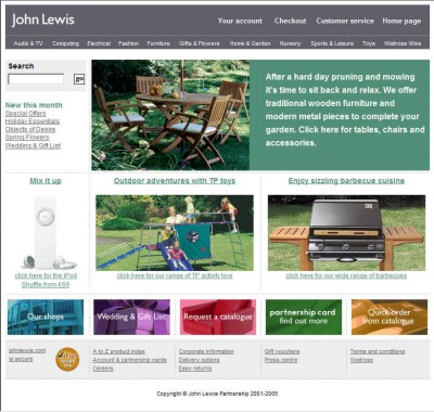
The UK department store John Lewis further llustrates this point.

John Lewis Homepage
The John Lewis site illustrates that even clear navigation titles can create a poor information scent.
The site has 11 main navigation titles:
- Audio & TV
- Computing
- Electrical
- Fashion
- Furniture
- Gifts & Flowers
- Home & Garden
- Nursery
- Sports & Leisure
- Toys
- Waitrose Wines
Almost without exception the navigation titles are simple and intuitive to understand, but which section would a user look in to find an iPod?
iPod could plausibly fit into at least three of the categories; Audio & TV, Computing or Electrical.
Do users have to visit each one until they find the correct information?
A fudged solution: multiple listings
Many organisations resolve the problem of weak information scents by listing content in multiple places.
This is exactly what John Lewis have done. iPods are listed in Audio & TV, Computing and Electrical.
Although it is fine to list a few high use pieces of content in multiple places, this approach can quickly clutter a site.
Navigation headings offer surprisingly weak information scent
Navigation headings alone don’t provide a strong enough scent
Many sites don’t expose content on home pages or section pages. The only method users have of finding content are navigation headings.
Navigation headings offer surprisingly weak information scent. Navigation headings are typically limited to one or two words, which often isn’t enough to clearly distinguish one heading from another and give a clear indication of the content offered in that section of the site.
Symptoms of poor information scent
The following are common symptoms of sites with poor information scent:
- People can’t find the information they want on the site and use alternate methods of finding information, such as call centres, or other off-line resources.
- People waste time finding information and feel negative towards the site.
- People give up and leave the site from decision pages (i.e. the homepage or section pages) rather than content pages.
How to create stronger information scents
The principles around how to create stronger information scents are quite simple, providing users with more context makes it easier for them to select the best option.
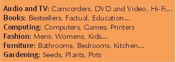
The following example illustrates this point:

Example 2
In the above list, where would a user look to find information about iPods?
Although iPod isn’t specifically mentioned beside any of the sections, the presence of a Hi-Fi option beside Audio and TV and the absence of any
iPod-like words beside the Computing option, creates a stronger information scent around the Audio and TV option.
Creating stronger information scents in three steps
Creating stronger information scents on a site is fairly straightforward.
- Identify the pages where users require more information to aid their decision.
- Typically this is the homepage and section pages.
- Devote part of the content area on each of these pages to giving more context to the navigation options the user has.
Identify the content within the section that users are most interested in (site statistics can help here), alternatively identify content or section titles that are representative of the content area as a whole. Present these pieces of content within the context of navigation headings.
Putting information scents into practice
Usability.gov and the UK version of the Orange site provide examples of alternative ways strong information scents can be added to the homepage of a site.
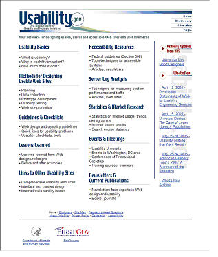
The homepage of the US government site, Usability.gov, creates strong information scents for each of the sections of the site.

Usability.gov webpage
The site achieves this by using a few content examples to differentiate between the sections of the site.
Unfortunately the content examples aren’t links. This could be frustrating for some users.
The approach taken by Usability.gov is successful, but may not be visually attractive enough for some organisations.
Orange’s UK site provides a visually more attractive example of how stronger information scents can be introduced to the homepage of a site.

Orange UK homepage
By placing the rich links within the context of the main navigation areas, users can quickly and easily identify the best option available from this page.
It is interesting to note that the Orange homepage doesn’t actually contain the global navigation that appears on all other pages of the site. This is a point often forgotten on many sites, the homepage is the only page that doesn’t need to employ the same global navigation as the rest of a site.
The principle roles of the homepage are to confirm to users that they have in fact arrived at the right place and provide them with a clear and simple first step towards the information they require.
Often this means clear space for branding and giving a sense of the breadth of content offered by the site. If this sense of the breadth of content is grounded in the navigation headings, as the Orange site does, it isn’t necessary to repeat the navigation headings on the homepage.
Conclusion
Increasing the strength of information scents on a site is easy to do and has a dramatic effect on a users ability to find the information they want.
Be careful not to take this approach to extremes. Presenting too much information on a page can make the page appear cluttered and decrease the chance a users will actually read the information at all.
Conducting usability testing alongside the redesign of a homepage and key decision making pages enables an organisation to evaluate the impact that stronger information scents have.


