Filed under: Intranets, Microsoft 365, SharePoint
At a fundamental level, SharePoint intranets are just the latest incarnation of intranets that have existed for decades. The best practices that have guided the development of great intranets apply equally well to those delivered using the Microsoft 365 platform.
That being said, the design decisions and functionality delivered by Microsoft do mean a fresh approach must be taken to key aspects relating to navigation and structure.
The key change is shifting SharePoint Modern to an entirely ‘flat’ structure, where there are many individual sites that sit side by side. Hubs can sit above these sites, but at present at least, they don’t provide significant structure or functionality.
Gone is the ‘sites and subsites’ structure of SharePoint Classic (thank goodness!), and it means that the sites themselves no longer reflect the information architecture that’s seen by users.

Microsoft has now delivered multiple ways to navigate, from various combinations of traditional intranet menus (including mega menus) to the relatively recent release of the ‘global navigation’ in the left-hand sidebar. While they can connect together in various ways, the practical upshot is that each of these menus can be handcrafted as the intranet manager sees fit.
While this new functionality is welcome, it does tend to muddy the waters for many teams. How should SharePoint be structured and managed? What’s the best way to deliver user-centric navigation that works for all staff?
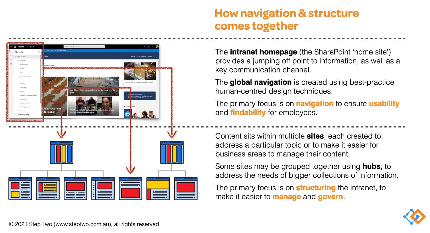
In our consulting work, we’re helping intranet teams to put shape around the design and delivery of intranets, separately from the under-the-hood technical work that needs to be done. In our engagements, we find that this slide from our best-practice guide is the one that generates a real ‘ah-ha’ moment for our clients:

Clearing up some terminology
Before we dive more into the approach outlined in the diagram above, it’s useful to establish clear terminology, something that Microsoft has, surprisingly ,not really addressed to date.
First off, we don’t use the phrase “information architecture” when working in SharePoint Modern. Why? Because it can mean every aspect of how SharePoint is configured and designed, or just one element of it. It also lumps together two aspects that are now best treated separately.
In practice, we use the following terms:
- Navigation experience: the menus and other features that help users find their way to required content.
- Site architecture: what sites are used to contain content, and how they are grouped together using hubs.
With this language in place, we can now explore practical approaches to delivering a user-centric SharePoint Modern intranet, starting with the site architecture.
SharePoint site architecture
The intranet for any moderately large or complex organisation will consist of multiple sites, which may or may not be grouped under hubs. These replace the ‘sections’ that make up traditional intranets.
Creating sites is all about content ownership and governance. In general, there are four reasons for creating sites.
- The site covers a larger topic, where page design and local navigation can help users quickly find what they need.
- It matches how the site will be managed, so business teams have ‘their’ space in which to share information.
- It serves a specific purpose, potentially in a time-limited way, such as a site for the ‘2022 corporate strategy’.
- It supports findability, often by matching the navigation experience in a useful way.
Hubs then sit above the sites, grouping together common resources, and providing local navigation (and search) experiences.
Navigation experience
If the site architecture is all about content ownership and governance, then the navigation experience is all about usability and findability.
SharePoint Modern now provides multiple navigation options, including:
- The top menus, which match traditional intranet navigation, noting that there can be two layers of these if hubs are used.
- Local navigation within sites, to help users find specific pieces of information.
- Global navigation, provided as part of the left-hand ‘app bar’.
With the site architecture in place, the navigation experience can be crafted independently, to drop users directly into key locations on the intranet.
As discussed in a previous article, the navigation experience should be user-tested, utilising the familiar techniques provided by human-centred design.
Splitting apart, to bring together
The goal for any intranet–including one built using SharePoint Modern–is to provide a simple, usable and effective experience.
By splitting apart site architecture and the navigation experience, each can be addressed in the best possible way. They then come together to provide a holistic experience that’s easy to manage and govern. Of course there will always be further considerations to address, as the platform keeps changing, and intranets keep growing in size and complexity.
Our consulting team is working with many clients around the globe to shape (or reshape!) their new SharePoint Modern intranets. Reach out if we can be of help to you.


