Filed under: Intranets, Usability

In recent times, we’ve been doing a lot of work in the university space, typically around determining a practical strategy for a new intranet/portal (depending on what you call it).
Our work is always informed by field research, and in one project, this involved holding four workshops with a mix of staff.
Very quickly, word started getting around, with comments and feedback from the workshops including:
- “Wow, am I in the right place, I thought this was a workshop about the portal?”
- “I wasn’t going to come along but a friend came to one of your workshops last week and said it was fun”
- “I feel like I am in Kindy (in a good way)”
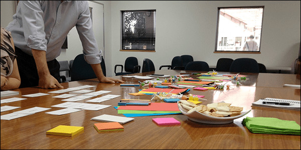
- “How did you manage to turn a grungy tute room into something that looks inviting?”
These are exactly the kinds of comments we’re looking for, because one of our consulting principles is: never underestimate the power of a colourful room.
(The photo above is from one of our actual sessions at the university.)
Our standard “consultants kit” now includes:
- coloured pens
- sticky notes
- coloured paper
- pens (of all sorts)
- sweets and lollies ;-)
It’s also about mixing up the formats, and using a range of different techniques to uncover insights. These approaches include:
- Microsoft Product Reaction Cards (“What is your ideal intranet?”)
- individual activities (“What are your information needs?”)
- group discussions (“What could be made easier?”)
- presentation (screenshots and examples from other universities)
- sketching (“What would the ideal intranet look like”)
- whole group discussions (“What should the university be telling us about?”)
After all, who said intranet projects can’t be fun? :-)


