Filed under: Digital workplace, Intranets, Usability

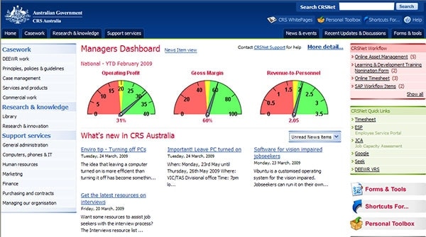
Screenshot courtesy of CRS Australia.
Alongside ‘the cloud’, ‘big data’ sits as one of the hottest topics, in both the business and government sectors. The power of the concept is obvious: organisations are already capturing huge amount of information about customers, why don’t we do something with that information?
Using huge databases, powerful software and the insight from experts, big data promises to have a real impact on how products are sold, and services delivered.
I was therefore interested to read an article in the latest Harvard Business Review (Good Data Won’t Guarantee Good Decisions by Shvetank Shah, Andrew Horne, Jaime Capella) that highlighted two key areas that are being overlooked. The first is that numbers are not enough by themselves to lead to good decision-making. What is needed is widespread ‘information literacy’, particularly amongst management, beyond just a small number of experts and consultants.
To quote:
Investment in analytics can be useless, even harmful, unless employees can incorporate that data into complex decision making. Our research offers a succinct warning. At this very moment, there’s an odds-on chance that someone in your organisation is making a poor decision on the basis of information that was enormously expensive to collect.
The second area they highlighted is the need to present and communicate the data in a way that will have the broadest impact on organisations. It is not enough just to have a complex reporting engine that will produce output on demand, as management at all levels of the organisation needs to understand and use data.
To quote:
Reliable information exists, but it’s hard to locate. Many organisations lack a coherent, accessible structure for the data they’ve collected. They’re like libraries with no card catalog and no covers on their books.
The article primarily focuses on the first point, and outlines a range of sensible suggestions around education and change management. A large survey conducted by the authors highlights the importance of taking an ‘informed skeptic’ view of data when making decisions, and explores how this mindset can be built up.
The second point was of most interest to us, and where intranets can fit in. This can, and should, occur on two levels.
Communicating key data
The screenshot above shows the homepage of CRS Australia, a mid-sized government agency. It shows the “dashboard view”, which can be enabled by managers, bringing key charts right to the front of the site. This is both a powerful tool, highlighting the key information that drives activities, and a powerful message, reinforcing the importance of the numbers.
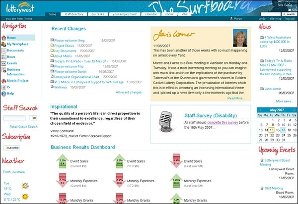
The example from Lotterywest at the end of the article shows a similar approach to surfacing key numbers of the intranet homepage.
In both cases, the figures are driven from back-end systems that are crunching through a lot of activity. Through careful selection and design, a handful of figures are communicated the whole organisation, giving life to what can otherwise be ‘dead’ figures.
There are many other examples we’ve seen of similar approaches. In some cases figures such as ‘net promoter’ score are displayed, while in other cases it’s the output of manufacturing processes.
This is the starting point for intranets and big data, and intranet teams should proactively seek out big data initiatives to see if the intranet can be used to convey a handful of business-critical metrics. This is a win-win outcome: it reinforces the role of the intranet homepage as the starting point for all things, and it gives much-needed early visibility to big data initiatives.
Designing great dashboards
In practice, though, very little of what big data can be distilled down to just a few graphs or figures. The sheer scale and scope of big data means that hundreds of different questions can be asked and answered.
While some of this will be surfaced via complex reporting solutions, this is a daunting option for most managers. What is needed are well-designed ‘dashboards’ that present a package of insights for a particular group of managers or staff.
Strong data and business analysis skills must be combined with great user experience (UX) techniques to deliver dashboards that work well. And again, the intranet plays a vital role in giving visibility and access to these dashboards.
(For more on designing great dashboards, listen to the UIE podcast with Hagan Rivers, and then watch the associated webinar.)
This is something that we covered in our Week in the digital workplace report, which presented a vision of data sitting seamlessly alongside content, integrated directly into the working practices of staff.
It’s also important to take a ‘service design’ approach to delivering big data information, targeting key processes and business needs, and designing end-to-end solutions to match.
In short, big data is, well, big. But the promise will only be realised if the data is presented in a way that works for the whole organisation, and supported with great skills and training.

Screenshot courtesy of Lotterywest.


