Filed under: Digital workplace, Intranets, Usability

Something strange has happened to intranet homepages. Despite the diversity of staff needs and activities, intranets have ended up with a fixed, static and unreactive homepage that only targets generic requirements.
Having fought so hard to balance competing stakeholder demands, intranet teams are often relieved to lock down the homepage. Functionality doesn’t change over time, and the homepage is often the slowest page to evolve.
In reaction to this, some intranets moved to an entirely “personalised” view, giving staff complete freedom on what “portlets” to include. This approach also works poorly, with only 5-10% of staff taking up personalisation functionality.
What’s needed is a middle ground, where the intranet homepage is more flexible, people-centric, and proactive.
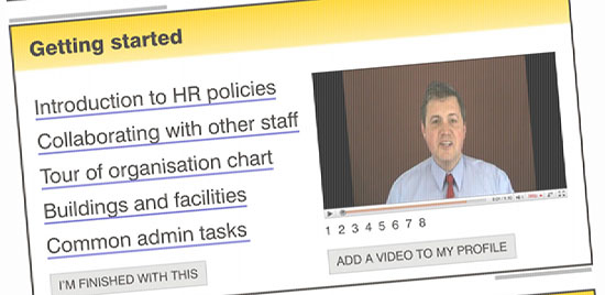
The mock screenshot above, created for my intranets in 2015 presentations, shows one possible — and very simple — example. New starters are provided with information directly for them, with a low-key way of dismissing the feature when they’re done with it. The homepage starts as being tailored for the new starter, and then evolves as their needs change.
There are many other possibilities:
- Tools targeted or tailored for key staff groups or business units.
- Global and local news, with the ability to choose what news is displayed.
- Task list that is displayed only when there are outstanding tasks to complete.
- Simple mechanisms for tweaking how the homepage works.
- Small business applications, directly on the homepage.
- “Seasonal” changes to the homepage, in response to key deadlines, activities and events.
All of this should be simple, low-key, and frictionless. Like the websites that we use routinely, we should take for granted that we can interact in a two-way fashion with intranets, without having to be techies or power users.
What have your experiences been? How can we make our homepages more reactive and responsive?


